Compass
Wayfinding simplified.
Role: UX|UI Designer
Timeline: 10 weeks
Tools:

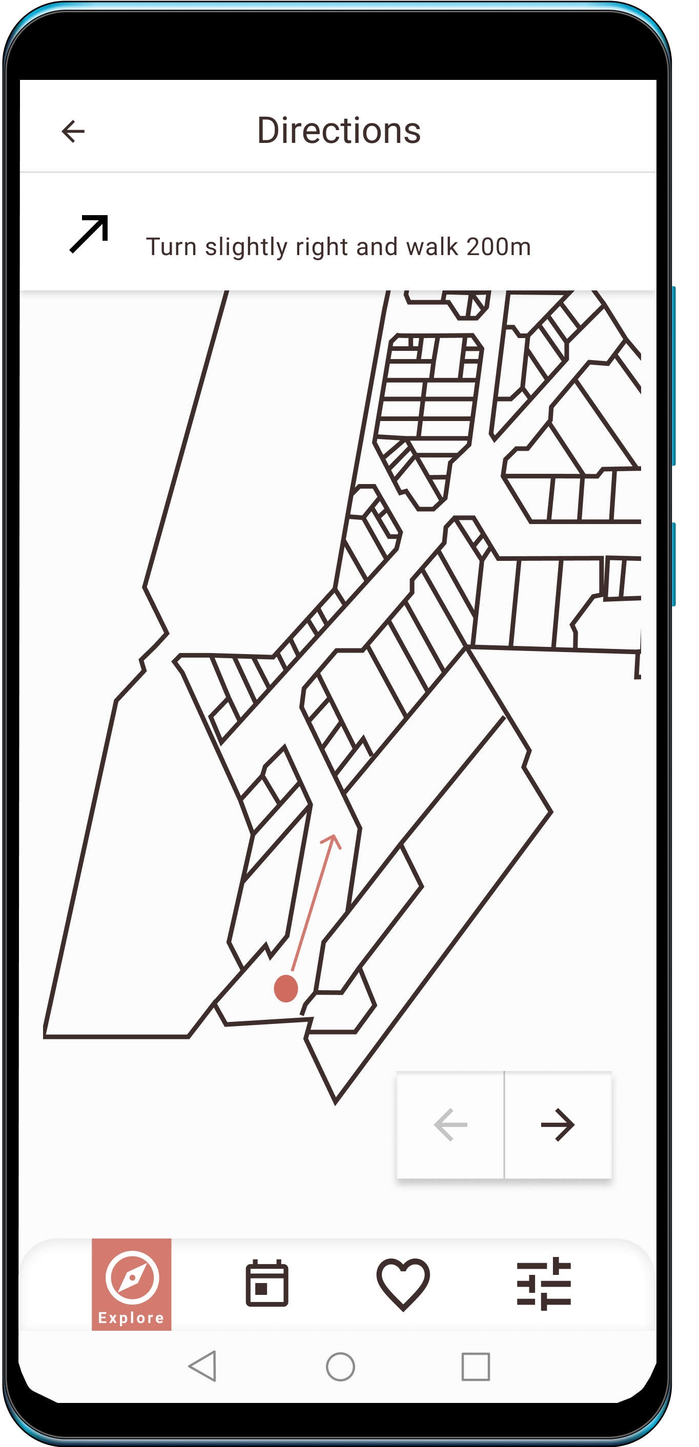
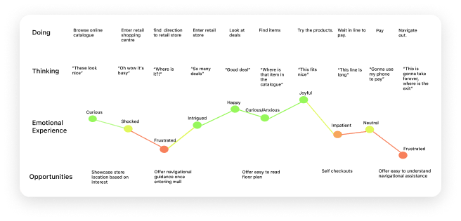
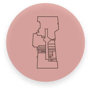
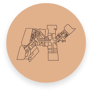
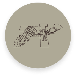
One day, I was trying to find my way through the mall by using the navigational diagram near the entrance. I realized everyone, including myself, who tried to use the diagram left confused and unsure. It did not have a clear indicator of where we were in the mall, which direction we were facing, nor were the stores clearly labelled. Instead, we had to utilize an index of a list of stores on the side and reference it with a code of sort on the map.
So I asked myself, “How can I improve this experience?”


"How might we engage users with purposeful interactions within a navigational tool in order to ease their wayfinding experience?"
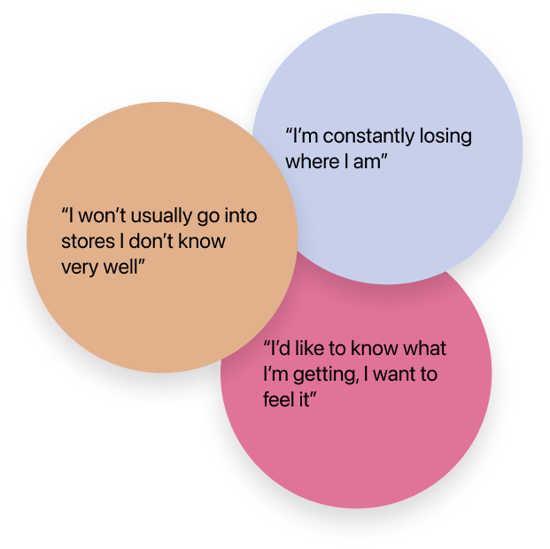
Pain Points
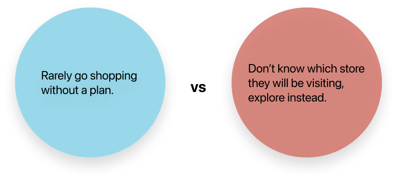
Motivation
Behaviour

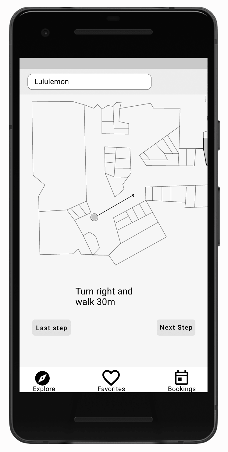
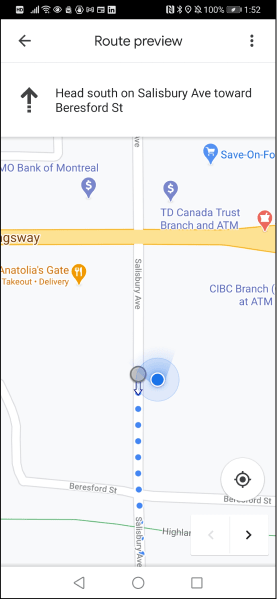
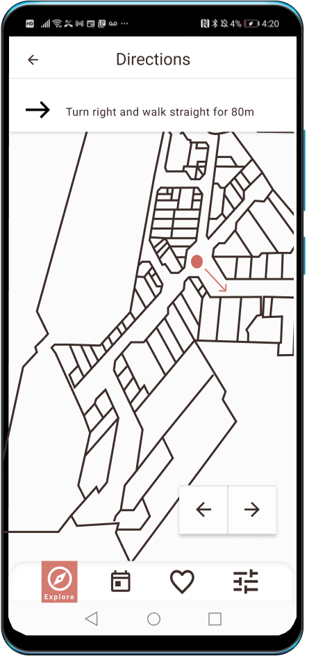
I believe a mobile wayfinding application that can accurately detect the user’s location and therefore give appropriate, real-time navigation would improve the shopping experience for humans within mall spaces.
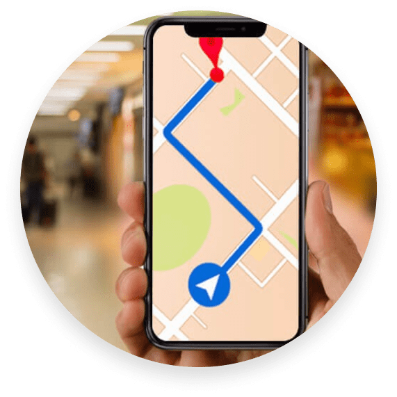
The solution is highly dependent on specialized indoor navigation systems that would be needed as the suggested solution requires accurately detecting the user’s location and the stores within the mall.

What I assumed to be true of my users:
Users have experience with using wayfinding applications, such as Google Maps.
Users understand their size when it comes to clothing specifically with major brands. "
Scenario I introduced to them:
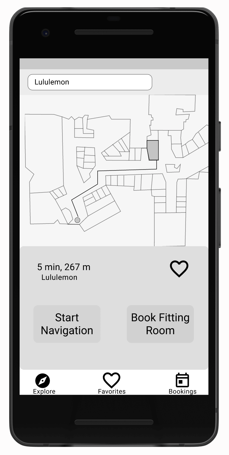
Amanda arrives at Metropolis mall in Metrotown, BC, Canada. She realizes she has actually downloaded a wayfinding application in the past, however she has never used it past creating an account. She now wants to use the application to find her way to her favorite retail store Lululemon.

Post name selection, I decided to create a mood board to further discover and understand the visual identity I intended to represent. I intentionally embarked on this step prior to the logo and wordmark creation as I wanted the wordmark and logo to represent the established identity.
Invision Moodboard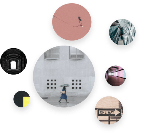
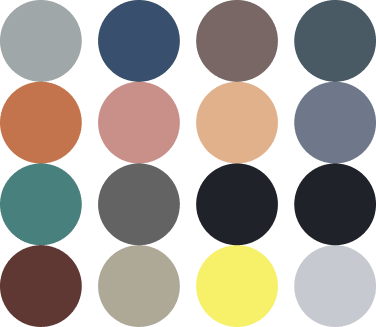
This allowed me to take a colour-focused look into my mood board sans the distraction of the other elements that make up an image.
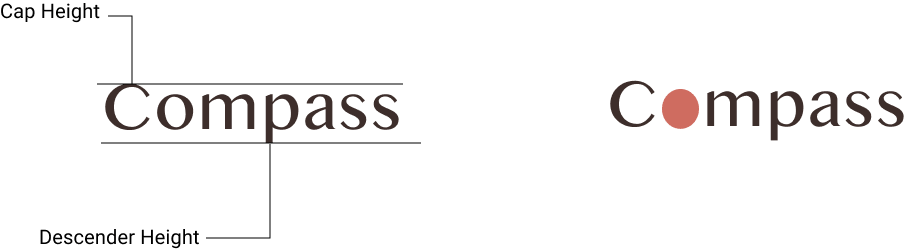
The cap height and X-height of Bangla MN are close in height. I wanted the descender height to be short because I thought this choice would de-emphasize the “-pass” part of the brand name, and emphasize the word as a whole.
The quick brown fox jumped over the lazy dog.
Design is more complex than just a pretty UI, it takes reearch and many rounds of testing and iterations to land on a usable application.
Initially I was afraid of the research aspect of design, however I now understand the steps necessary to formulate a complete research plan and execution.
Who does?
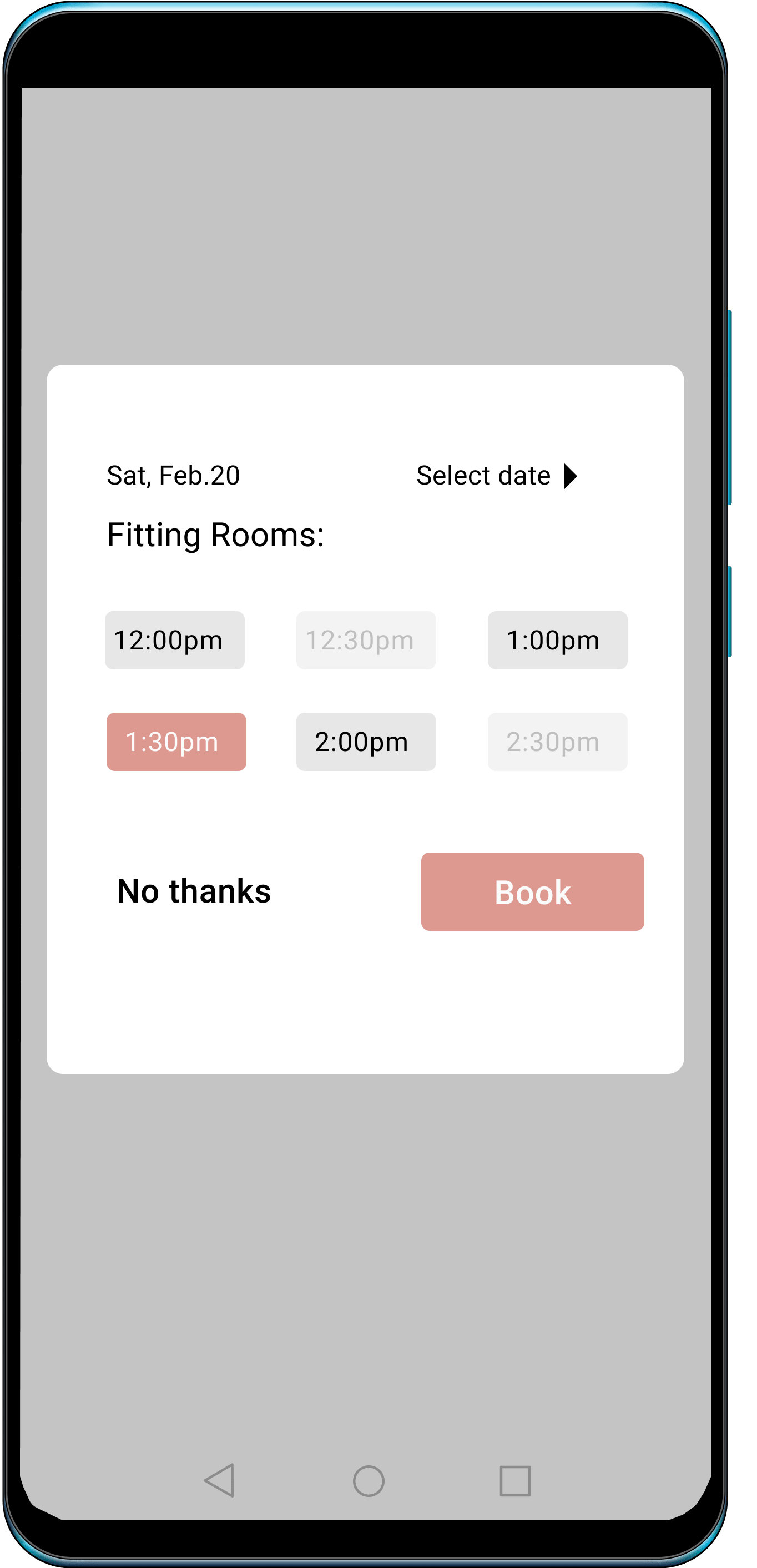
The ability to book multiple fitting rooms would greatly enhance the usability of Compass.
Following current trends a dark theme would be easier on the eyes and save energy.
Not all users are equally capable, Compass should work for everyone.
Users don’t just navigate to one store but to multiple one’s. Compass should be able to create route involving more than just one store.
Sorry, the website is currently not mobile friendly... Trust me, I'm working on it.